
Lancia Delta. Lancia Kappa. Lancia Phedra. You may have never noticed that the legendary Italian brand Lancia has always used Greek names on its models. Whether from the Greek alphabet or Greek names, Lancia, almost from its "genesis" was, is and will be inextricably linked to Greco-Roman culture. Below, Stellantis takes us on a retro-trip through time, explaining how this connection came about.
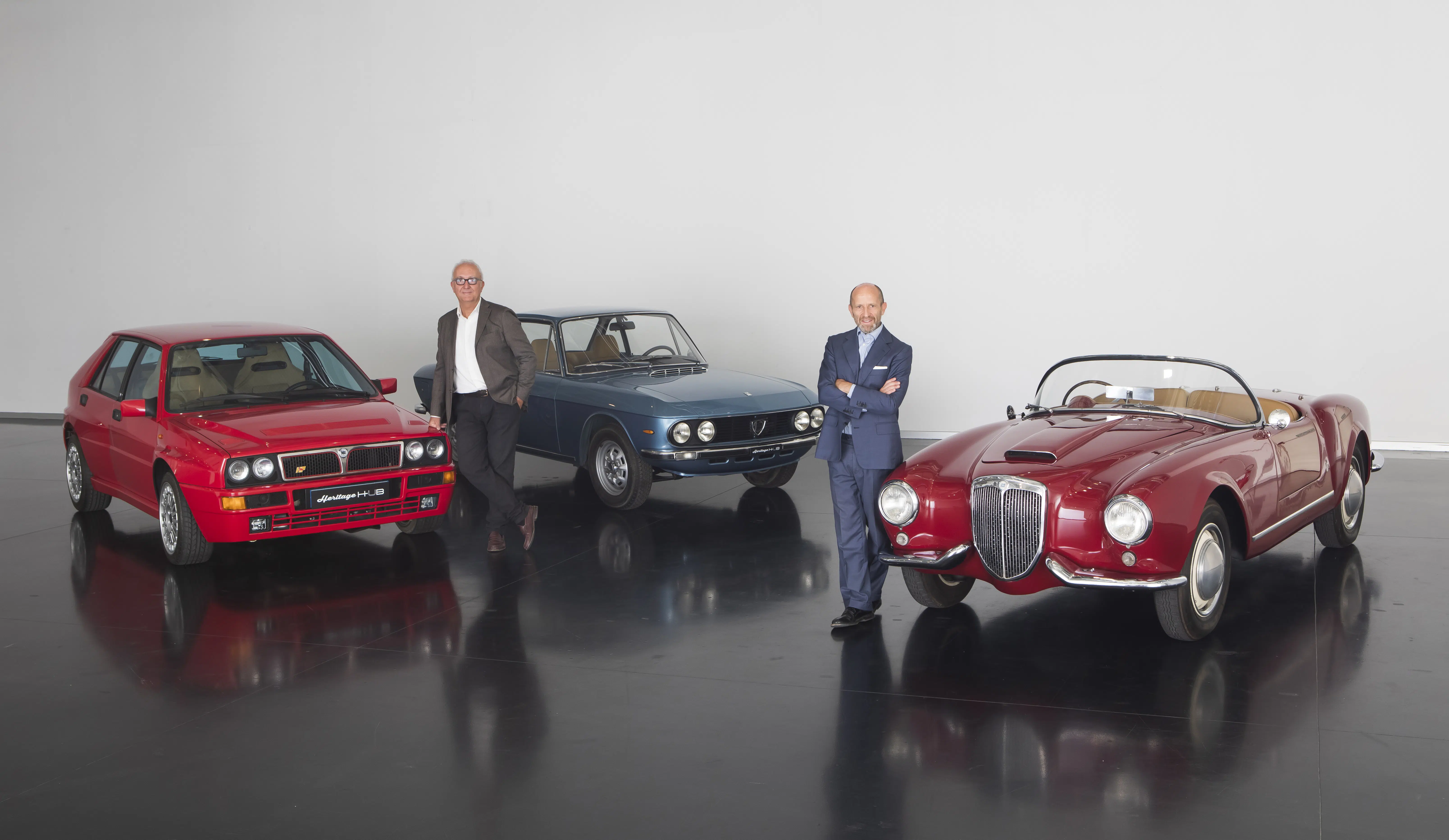
After the first episode of the Lancia documentary "Elegance on the move", in which the brand's CEO Luca Napolitano spoke with Stellantis Group Head of Design Jean-Pierre Ploué, now another designer, Roberto Giolito, Head of Heritage, delves into the history of the brand's model names and logo.
"Lancia is a brand with a strong identity that has been developed since the early days of its history and remains unchanged to this day.", says brand CEO Luca Napolitano. "A strong identity with an elegant and distinctive logo, but also legendary models with names inspired by the Greek alphabet and ancient Rome. This is a rare heritage that we want to preserve and inspire us for the future."
The evolution of an elegant and distinctive symbol
The history of Lancia's identity can also be seen through its logo, which has always included two distinctive elements: a steering wheel and a spear.
- Lancia, a brand with a capital "L"
The first Lancia logo, introduced in 1907, was very simple. The name "Lancia" in capital letters on a dark square base. The "L" was significantly larger than the other letters, an element that would characterize the logo for decades. In the same year, a softer version was introduced, with the word Lancia written in gold letters. The style matches that of the brand's early cars, which were influenced by the Art Nouveau artistic movement.
- With the inspiration of Count Carlo Biscaretti di Ruffia
With the first signs of success, Vincenzo Lancia wanted a strong logo for his creations, a logo that everyone would recognise at first sight. In 1911 he entrusted this project to his good friend, Count Carlo Biscaretti di Rufia, an artist, advertiser and car enthusiast who, among other things, founded the Museo Nazionale dell'Automobile in Turin.
The Count created 5 different sketches and as Mr. Roberto Giolito, Head of Heritage explains, "Vincenzo Lancia chose the one that best expressed the brand's philosophy. The sketch included a 4-spoke steering wheel, a 'handgauge' control, a square flag and a spear-like shaft. Few elements, but well placed, some of which have remained unchanged in time." The implementation of the new logo began in 1922.
- The spear and the shield. Two elegant and recognizable symbols
In 1929, the Lancia logo changed shape again and a triangular shield appeared around the steering wheel, an element that is still present today. Designed again by Biscaretti di Ruffia, it featured blue on the shield, flag and spear, white on the base and steering wheel and gold for the letters.
- A radical redesign of the logoυ
With the launch of the Flaminia in 1957, a new logo appeared, quite simple, but still elegant and imposing. The shield and steering wheel were replaced with simpler geometric elements and the colours were reduced to two: blue and silver. The spear holds the flag while the name "Lancia" continues to be composed of capital letters with the "L" being larger than the rest.
- Bridge to the past
When the Fiat Group took over Lancia in 1969, the logo was revised again, with the return of the original 1907 square logo. The first model to use it was the 1972 Beta. In 1981 another evolution created a bridge to the past. Designer Massimo Vignelli proposed using all the elements of the 192 logo, with the shield, spear, handlebars and flag and unique colours of blue and white. Finally for the first time the "L" in the name was given the same size as the other letters.
- A stylish logo for the new millennium
The significant changes to the brand at the beginning of the third millennium also influenced the logo. 2007 saw a revolution but retained some key characteristics of the brand's DNA. The blue colour became darker and glossier, the steering wheel gained two spokes, and the spear and flag were removed.
Greco-Roman classicism in the names of Lancia's legendary models
The evolution of the Lancia logo is interesting, but equally interesting is the history of the names of its models, which were inspired by the rich cultural heritage of the ancient civilisations of Greece and Rome.

From horsepower to the letters of the Greek alphabet
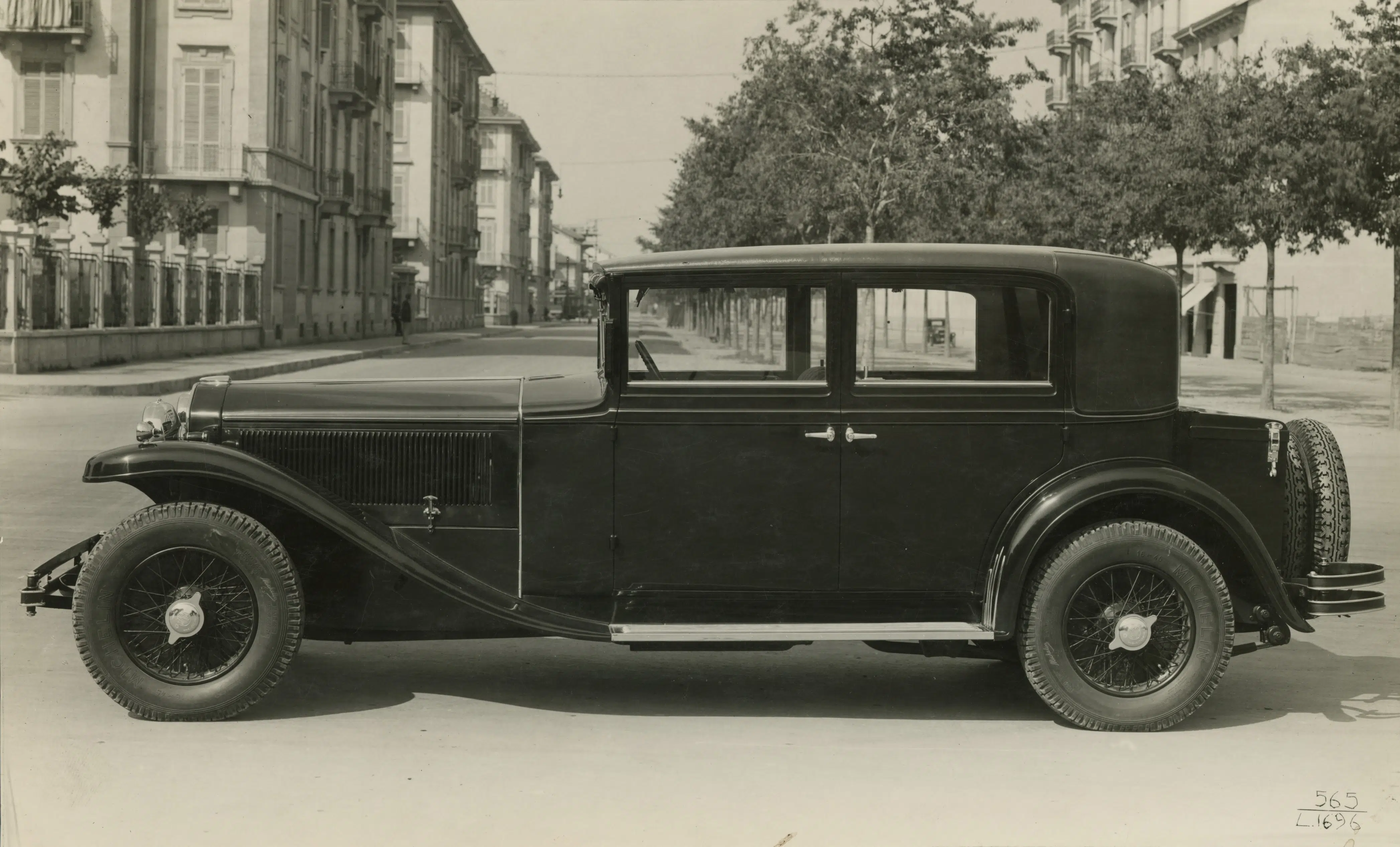
In the first decades of the 20th century, all Lancias were identified by the brand name and the reference horsepower, for example: 12 HP, 18/24 HP, 20/30 HP, 25/35 HP. But in 1919 an inspiration came along that would change the history of the brand. Vincenzo Lancia wanted to give a stronger identity to his creations and following the suggestion of his brother Giovanni, a professor of classical education, he chose the letters of the Greek alphabet. The first model to follow this idea was the 1919 Lancia Kappa. A revolutionary idea that led to the renaming of older models and so the 12 HP was called "Alpha", the 1909 model, Beta, the 1910 model, Gamma, the 1911 model, Delta, finally reaching up to the Lambda of 1922. At that time, the last model to use a Greek letter for its name was the "Dilambda" prototype unveiled at the 1929 New York Auto Show.
The 1930s and the names from ancient Rome
In the 1930s, Vincenzo Lancia decided to abandon the Greek alphabet and use historical place names from ancient Rome. The first were Artena and Astura, followed by Augusta, Aprilia and Ardea. In 1931, in order to launch his vehicles in France, Vincenzo Lancia founded "Lancia Automobiles" and gave French names to his cars, such as "Belna" and "Ardennes" for Augusta and Aprilia respectively. The models were such a success that at the 1936 Paris Motor Show, Henry Ford waited until the show was closed to see the Aprilia alone, at his leisure. But security staff stopped him, with the American saying: "Η Aprilia it's the only car at the show worth making a fuss about."
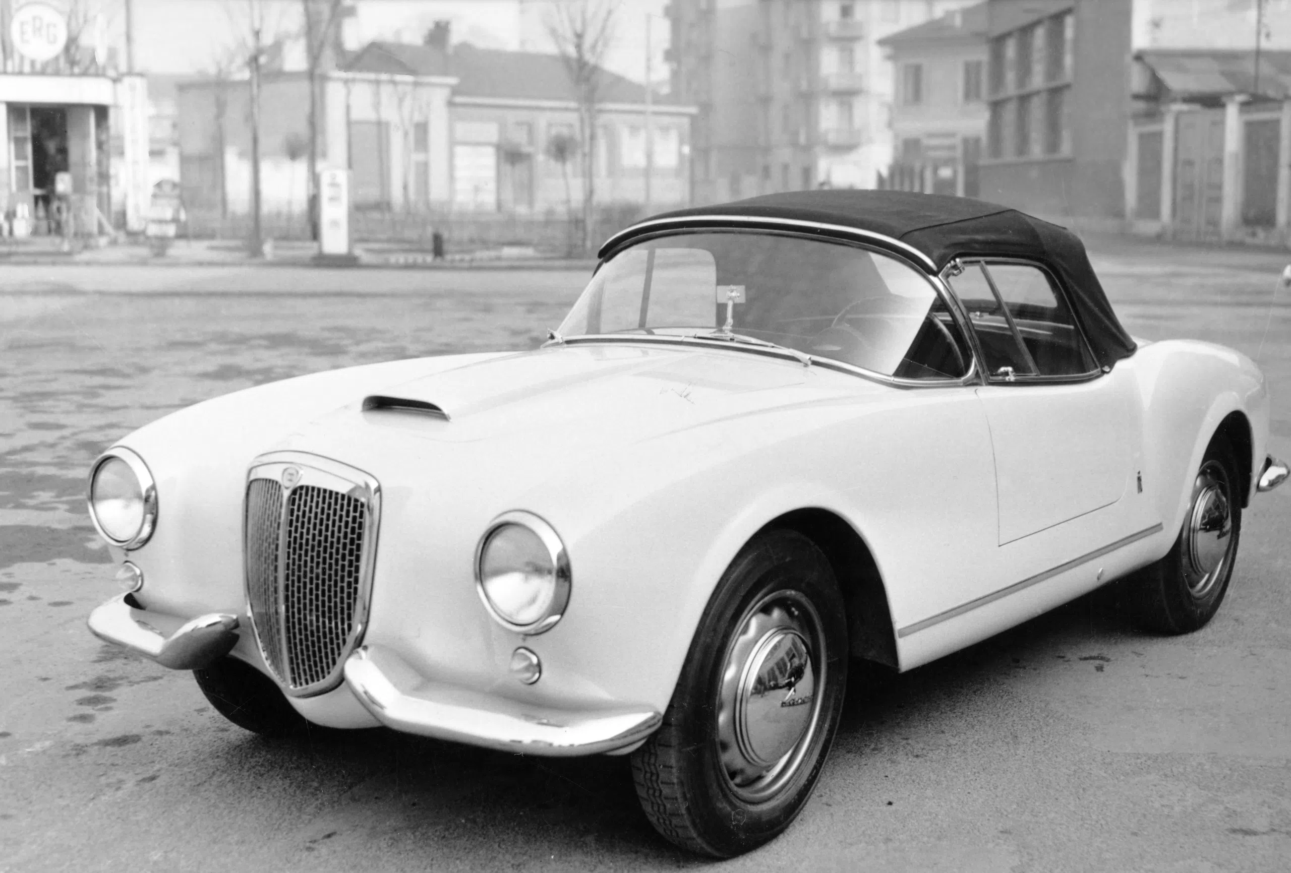
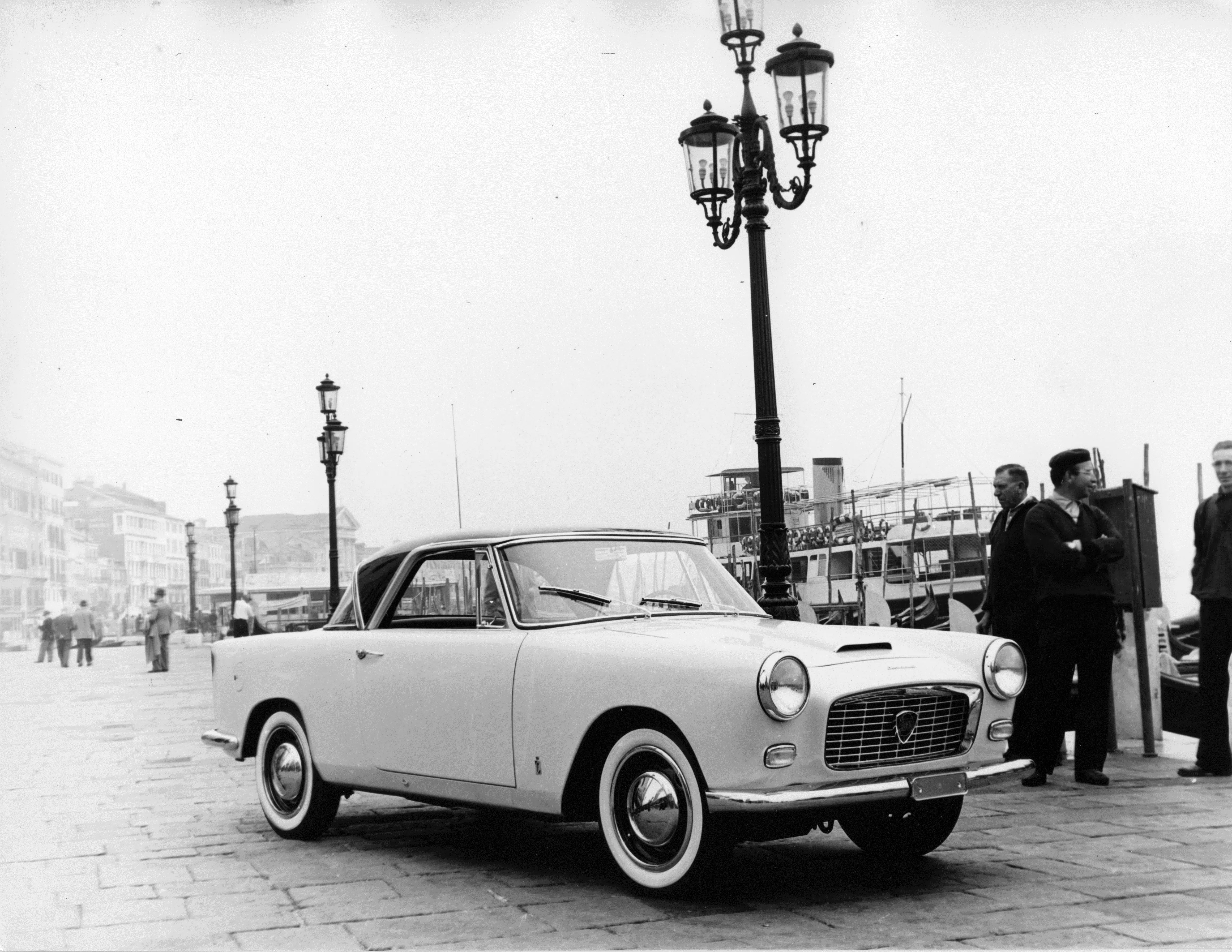
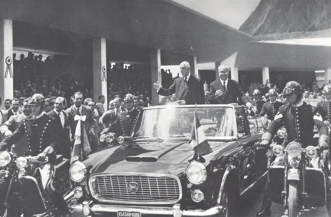
In the 1950s, the legendary models of Lancia are named after streets of ancient Rome
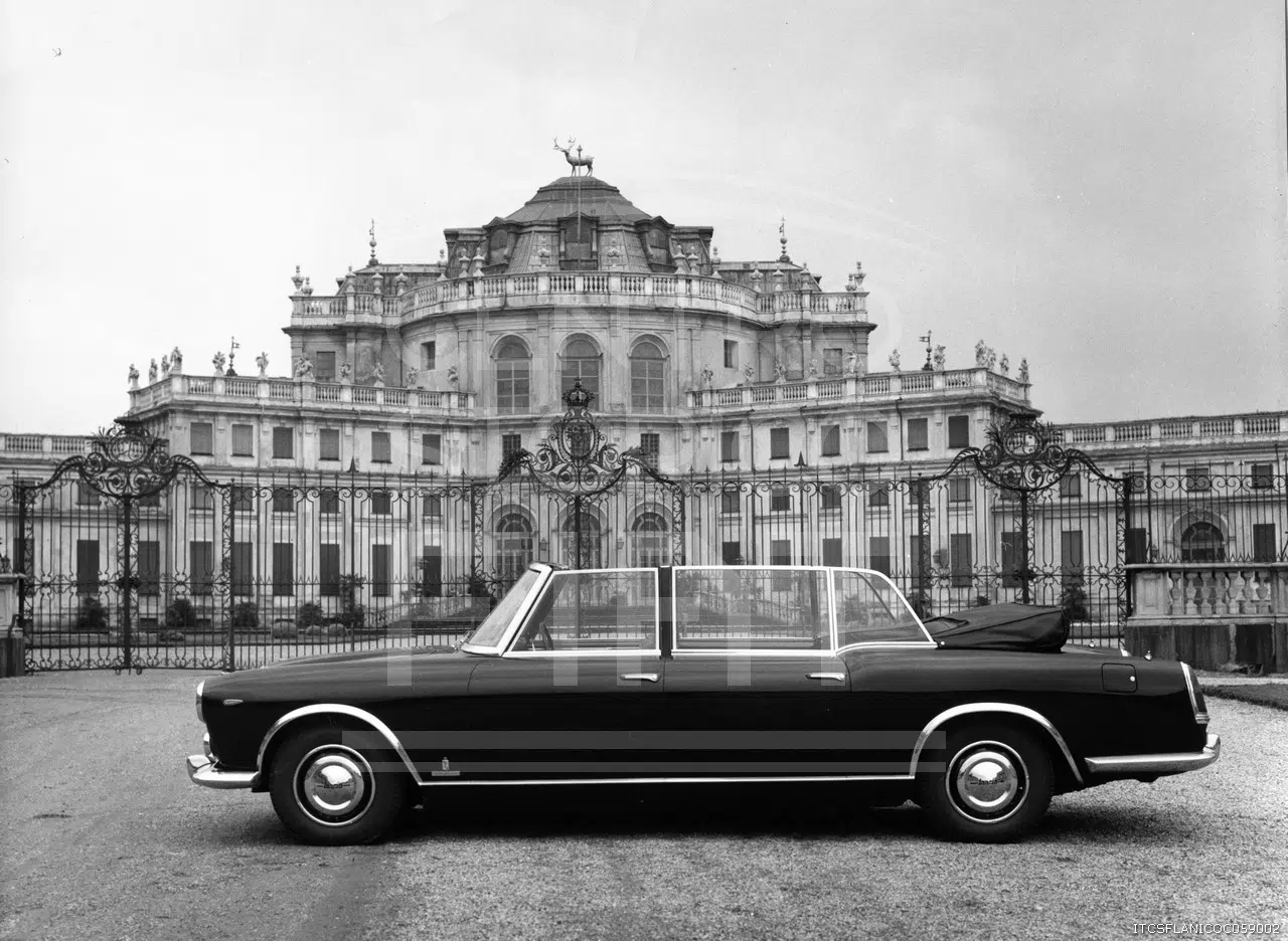
After the 2ο FP, the company's fortunes passed to Gianni Lancia, son of the brand's founder, with the models changing names once again. The inspiration from Roman times remained, but was based on famous roads: the Aurelia, Appia and then Flaminia, Flavia and Fulvia. At the time, a special version of the Flaminia was also used as a Presidential car, on the occasion of Queen Elizabeth's visit to Italy in 1961. The four cars were named after the famous horses Belfiore, Belmonte, Belvedere and Belsito.
Back to the Greek alphabet from the 1970s to the present day
The Fiat Group acquired Lancia in the autumn of 1969 and opened a new page in the brand's history. It was decided to return to the original logo, but also to use again the letters from the Greek alphabet. The first car of the change was the 1972 Beta, followed by the 1976 Gamma and then in 1979 the Delta. The inspiration from the classic times continued with the Prisma (1982), the Thema (1984) and the Thesis and Phedra (2002) and of course the Y, the brand's absolute best seller with more than 3 million sales, 4 generations and 35 years of history.
Lancia's strong identity is underlined by its elegant logo and the names of its legendary models. A rich heritage from 1906 that is poised to inspire the new chapter that is opening for the brand.
And the story continues...


I love this article as it was my first love and the only car brand I chose for my first car.
Thank you for your comment and we hope you love your next car as much as the first one!